


Why structured article blocks work in practice
This first block now continues the story after the intro instead of repeating it. It explains how block-based structure improves scanning, governance and long-term maintainability for editorial teams.
From here, each next block demonstrates a distinct layout pattern with a specific communication goal.
Two-column framing: strategy and operations
Editorially, two-column text works best when one side explains strategic intent and the other side clarifies practical execution. This keeps specialist readers engaged while still supporting quick scanning by operational teams.
For internal communication, this format helps align product, field and regional stakeholders around the same message structure, even when they consume the page in different ways.

Visual note: keep captions practical and evidence-oriented so teams know how to interpret the image in field context.
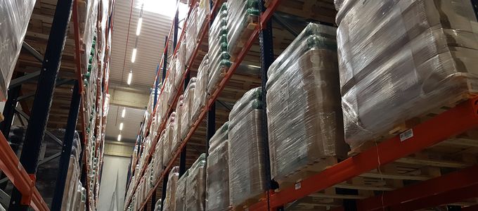
Media left, text right
This block demonstrates image-first storytelling. Readers immediately see the key visual, while the right column provides interpretation and application context.
Use this pattern when visual evidence should lead the narrative, followed by concise explanation and next action.
Media right, text left
This layout keeps narrative flow on the left while allowing supporting media on the right. It is useful when the text carries the key argument and media acts as reinforcement.
In editorial practice, this helps teams prevent over-reliance on visuals while still giving readers proof points.
YouTube note: clip 1 for the media-right demonstration block.
YouTube note: clip 2 for the media-full-left demonstration block.
Media full left, text right
Full-size media can carry strong narrative weight when introducing implementation outcomes, trial snapshots or before/after comparisons.
The text column should stay focused on interpretation, not repetition of what is already visible in the image.
Media full right, text left
This variation creates rhythm on long pages and avoids a repetitive left-to-right pattern. It supports engagement while preserving visual consistency.
Use this block when you want to keep reader attention high between dense explanatory sections.
Video note: summarize the operational takeaway in one sentence so teams can apply it immediately.
Frequently asked questions
This accordion section groups recurring questions so content remains practical without overloading the main story flow.
Blocks improve readability, reduce cognitive overload and make it easier to keep updates localized. Teams can adjust one section without rewriting an entire page.
Choose image when one static proof point is enough. Choose YouTube when process explanation or sequence matters. Keep notes concise and operational.
Use the same structure each time: pick type, fill relevant fields only, and write one clear takeaway per block. Avoid mixing multiple goals in one block.
Verify order, visibility, media-source match, caption relevance, and whether accordion/tab items map to the right parent block.
Review templates quarterly, collect editor feedback, and retire blocks that repeatedly cause confusion. Consistency beats novelty in operational comms.
Topic comparison by tabs
Tabs help readers compare viewpoints (performance, health, implementation and quality) without losing context.
Performance messaging should translate trial outcomes into practical field expectations, with clear boundaries and context.